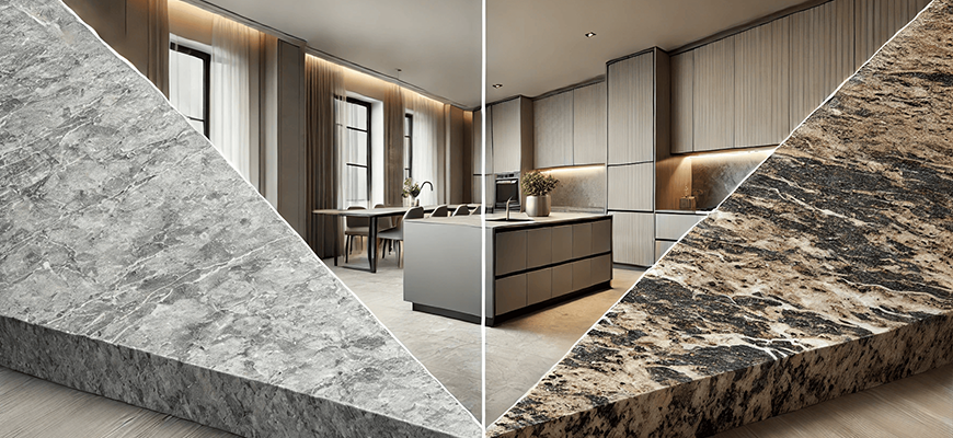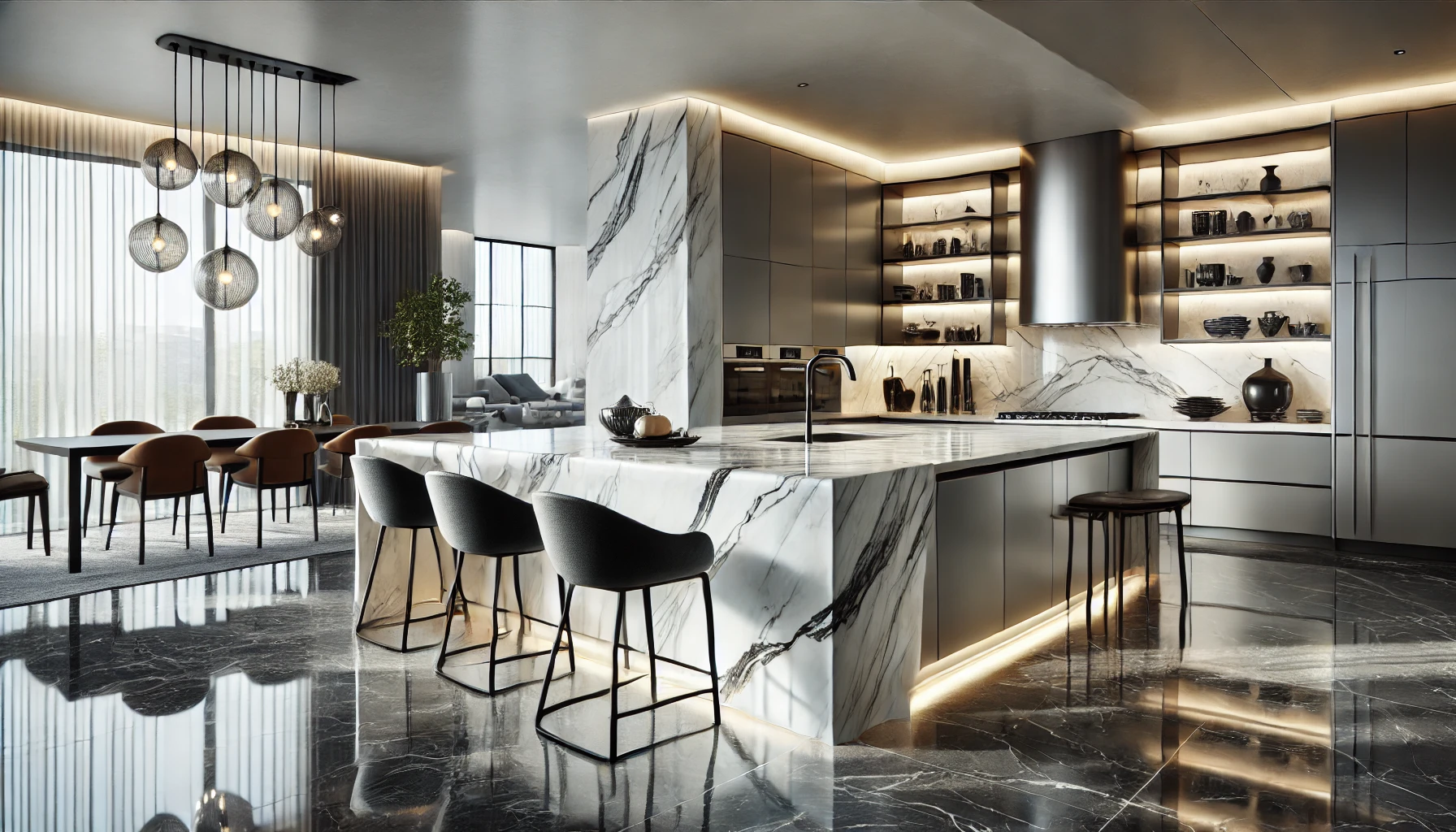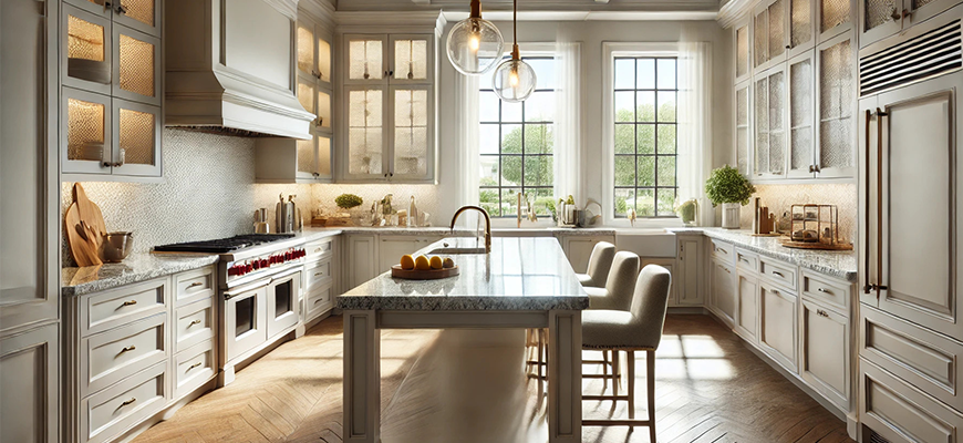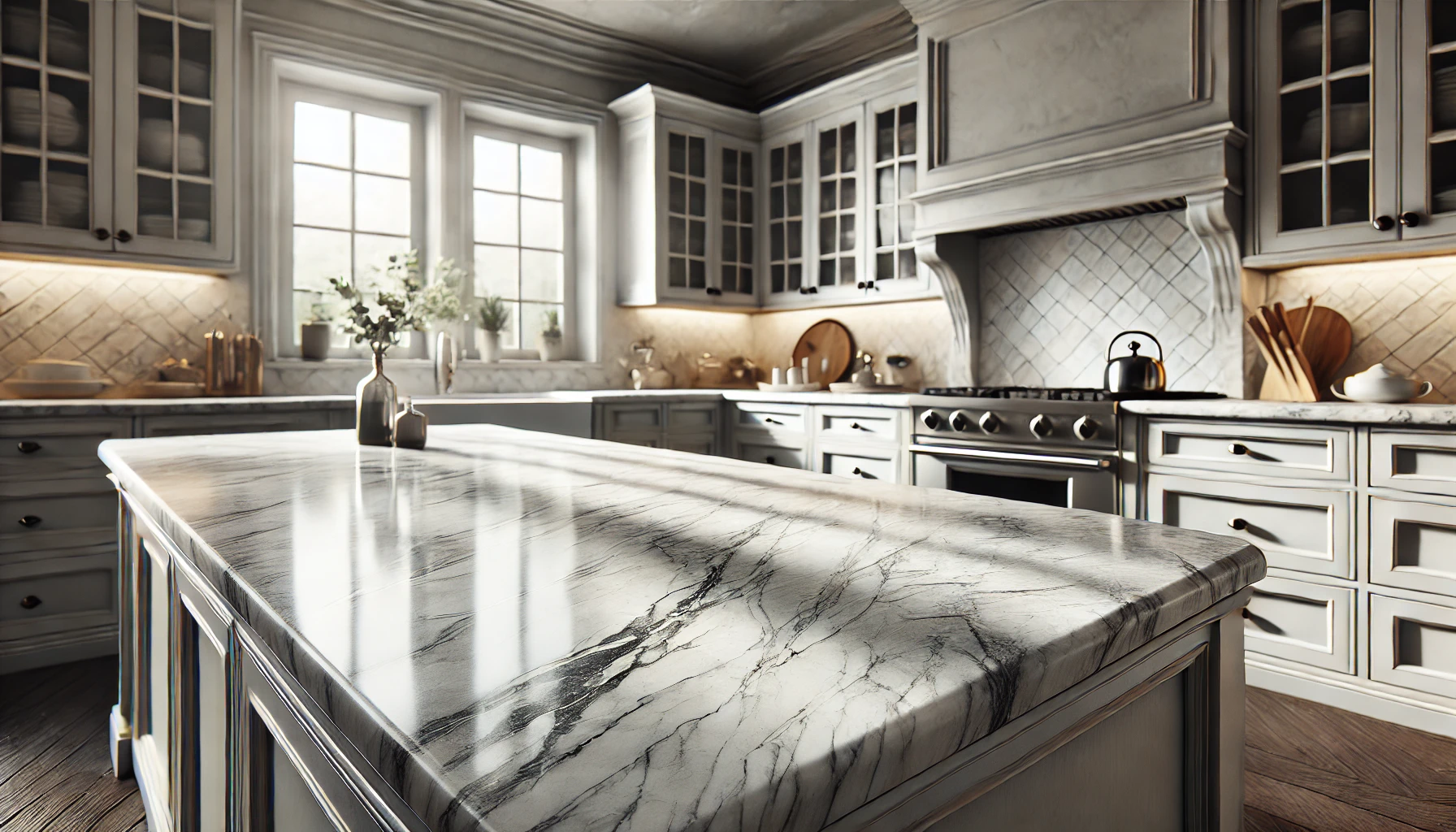
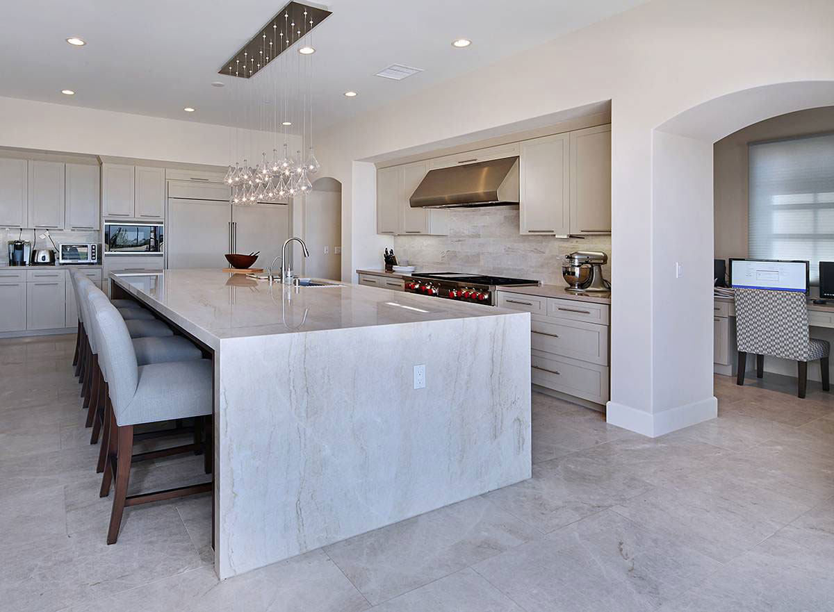
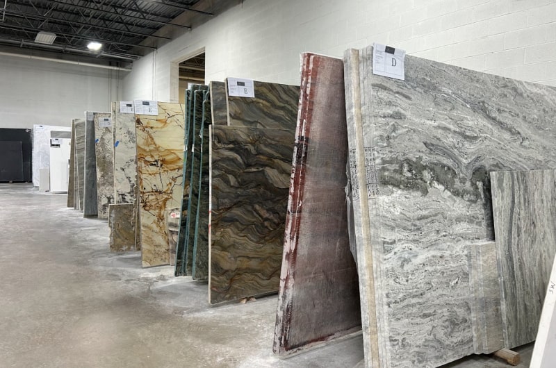
Taj Mahal Quartzite is a popular natural stone that is widely used indoors, where warm and welcoming interiors are preferred. The distinct beauty of Taj Mahal Quartzite lies in its color. The natural stone color emphasizes the depth and story of the space. The soft tones, warm base, refined veining, and muted palette create a calm surface. It complements many design styles. Because homeowners often expect bold quartzite patterns, Taj Mahal quartzite countertops’ gentle appearance makes a subtle and stunning centerpiece. The stone surface looks subtle from a distance but detailed up close. It balances between warm beige, faint gray, and soft gold. The color tones have made it a top-tier premium quartzite for kitchen and bathroom projects.
Taj Mahal Quartzite Color Breakdown
| Color Element | Description | Notes for Design |
| Base Tone | Creamy beige / warm ivory | Sets a neutral and soft foundation |
| Primary Veins | Gold, champagne, and taupe lines | Provide warmth without intensity |
| Secondary Veins | Warm gray and greige shading | Support modern and transitional designs |
| Undertones | Sand, hazelnut, muted brown | Add depth and organic structure |
| Overall Temperature | Warm- neutral tones | Works with many wood species and paint colors |
| Surface Pattern | Subtle movement, long veins | Ideal for large islands and countertops |
| Visual Density | Low to medium | Feels calm and balanced |
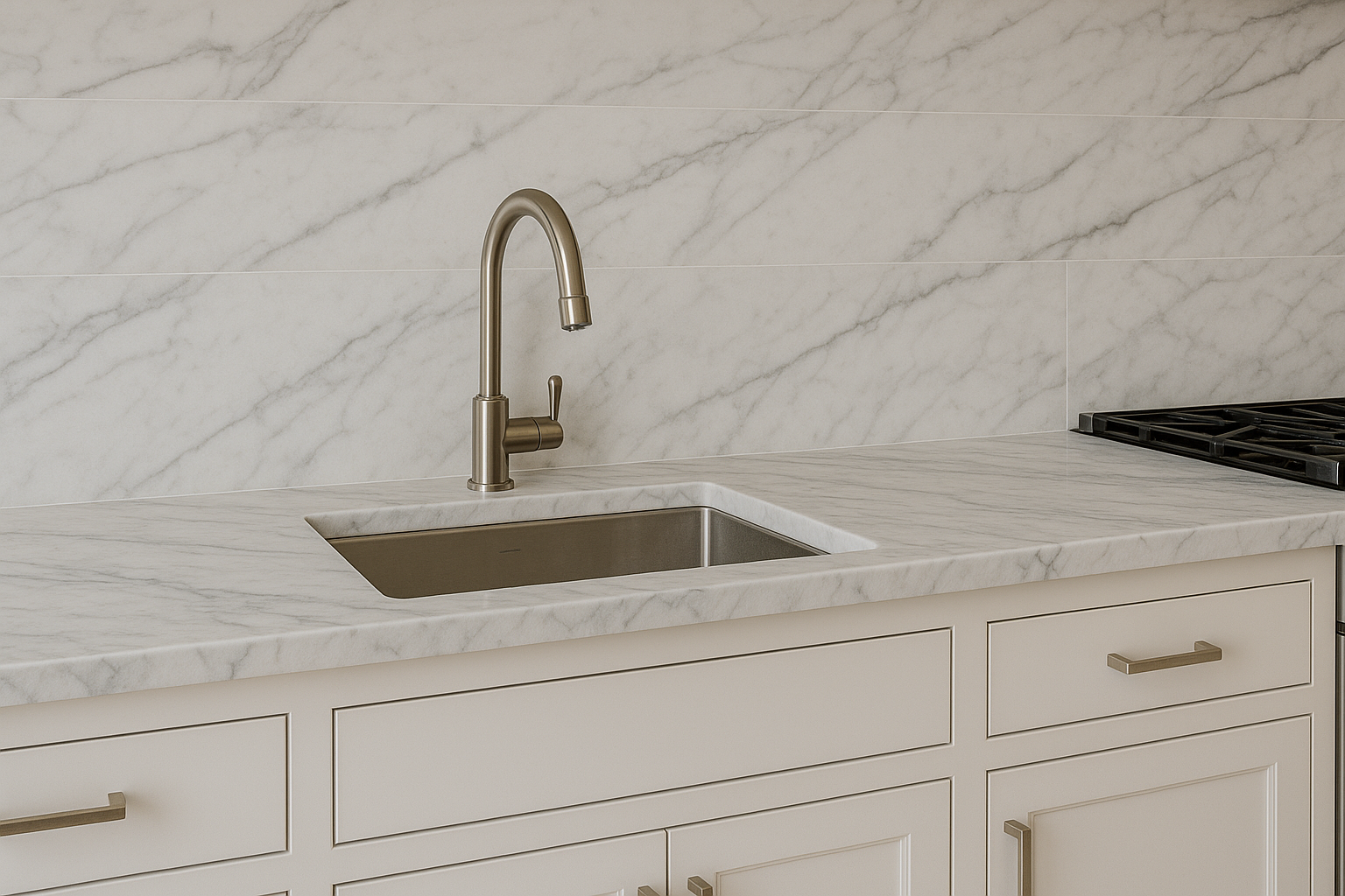
The color of Taj Mahal quartzite lies in the warm neutral category. The background surface looks creamy white, but it also looks beige rather than bright white. You can also notice the thin vein pattern running around the slab in gold, taupe, warm gray, and sometimes light brown. The veins do not dominate the stone, but they create soft lines or delicate waves. This gives the slab a smooth and layered look.
Most stone slabs include:
- A light beige base
- Sand-like undertones
- Subtle gold or champagne streaks
- Grey-beige (greige) shading near the edges
- Occasional patches that read as hazelnut or ivory
The color feels warm, but in a subtle way, not bright yellowish. This looks elegant but polished like marble, and organic but not rustic. This makes it versatile and safe for long-term design.
What Are the 4 Shades of the Taj Mahal?
You can find these four core shade categories:
1. Creamy Beige
This is the base shade or the color of the main surface. It makes the stone appear warm-neutral. It works well in bright spaces and soft, cool artificial lighting.
2. Soft Gold
Many Taj Mahal quartzite slabs include faint gold or champagne veins. They create a warm look and add personality to the stone, making the surface stand out.
3. Taupe
Taupe veins of patches come in diagonal lines. They bridge the gap between gray and beige. This helps the stone pair easier with greige paint and modern cabinets.
4. Warm Gray
The warm gray veins keep the stone grounded. These lines prevent the beige from feeling too warm and help tie Taj Mahal into cooler palettes when needed.
What Colors Go Well With Taj Mahal Quartzite?
You can opt for the cal and earthy neutral color pellet that works great with Taj Mahal quartzite. The warm background complements many palettes, including:
Warm Neutrals
- Cream
- Almond
- Linen white
- Soft sand
These tones reinforce the quartzite’s warmth.
Greige and Taupe
- Revere Pewter
- Accessible Beige
- Pale Oak
Greige anchors the stone and enhances the taupe veins.
Muted Browns
- Walnut
- Chestnut
- Smoky beige
These support the hazelnut undertones.
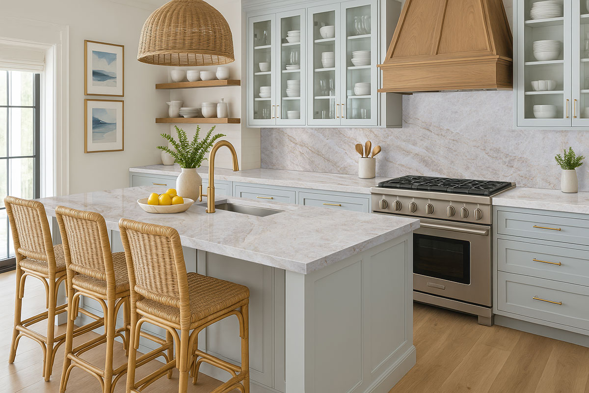
Soft Greens and Sage
- Silvermist
- Evergreen Fog
- Sea Salt
Sage greens create a natural, calming aesthetic.
Charcoal Accents
Charcoal contrasts with the warm base without overwhelming it.
What Tile Complements Taj Mahal Quartzite?
When selecting complementary tiles for the kitchen design, you should determine whether you want flow or contrast.
1. Porcelain Tile in Warm Beige or Cream
You can create a unified look by matching the base tone.
2. Light Greige Porcelain Tile
Pulls out the greige shading in the veins and works well in modern settings.
3. Textured Stone-Look Porcelain
Travertine-look or limestone-look porcelain tiles create a stunning combination because they have the same sandy undertones.
4. Warm Gray Tile
It creates contrast while complementing the warm gray veins.
5. Subtle Zellige Tile
White, off-white, or Moroccan clay tiles add texture without clashing.
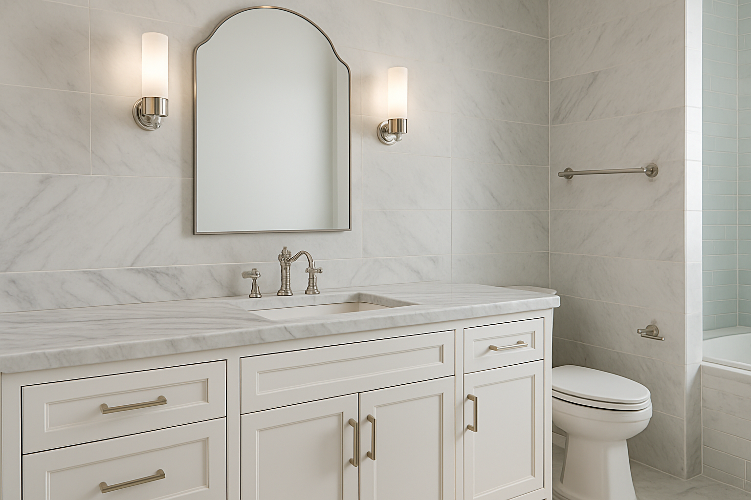
What Color Cabinets Go With Taj Mahal Quartzite?
Cabinet and countertop color define how the Taj Mahal will look in the room. Each cabinet tone creates a different shade in the stone. Many homeowners specifically search for what color cabinets go with Taj Mahal quartzite when trying to balance its creamy beige base with warm gray and taupe veining.
White Cabinets
These cabinets are universally complementary cabinet colors. But they work best with creamy white, but not stark white.
Greige Cabinets
One of the most popular combinations for 2025. Greige highlights the taupe veins.
Light Wood Cabinets
Light-colored cabinets like White oak, maple, and ash work beautifully with the golden veins.
Medium Wood Cabinets
Cabinets like walnut or chestnut create a warm and welcoming feel in the space further.
Dark Cabinets
Espresso and charcoal create a bold contrast and elevate the stone’s brightness.

What Wall And Floor Colors Complement Taj Mahal Quartzite?
Taj Mahal quartzite is undoubtedly a great choice for a warm and cost look. However, you can maximize the look and feel with complementary walls and floor.
Flooring Options
Choose flooring that either mirrors the quartzite’s warmth or creates a gentle contrast.
- White oak flooring enhances the soft gold veins.
- Natural maple ties into the sandy undertones.
- Greige vinyl plank connects with the taupe and gray notes.
- Warm beige porcelain creates an uninterrupted flow.
Wall Colors
Walls should create a soft Walls should follow a soft, natural palette. The recommended tones are:
- Classic Cream
- Pale Greige
- Soft Taupe
- Warm White
- Misty Green
- Clay Beige
You should not use stark whites that can make the slab appear slightly yellow.
FAQs About Taj Mahal Quartzite Color
Let’s answer your question about Taj Mahal Quartzite.
What color is replacing gray in modern design?
Warm neutrals, greige, and earthy beige tones are replacing cool gray.
What is the best backsplash for Taj Mahal quartzite?
A warm white subway tile, a soft greige ceramic tile, or a textured Zellige backsplash pairs best with Taj Mahal quartzite.
Is the Taj Mahal grey?
No. Taj Mahal quartzite is basically creamy beige with warm gray and taupe veins.
What is the 1/3 rule for cabinets?
The 1.3 rule suggests balancing upper cabinets, lower cabinets, and open space so each occupies about one-third of the visual height of the wall.
Can you use Dawn dish soap on quartzite?
Yes, mild dish soap like Dawn is generally safe for quartzite when diluted with warm water.
The Bottom Line
Taj Mahal quartzite features a creamy beige surface with soft gold, taupe, and warm gray movement. It has a layered warmth, which makes it one of the most adaptable natural stones for modern designs. This also makes the quartzite a better choice than quartz in terms of aesthetics. The stone also works well with greige walls, white oak cabinets, textured tile, and warm-neutral palettes that remain timeless beyond trend cycles.
This color consistency, along with durability, makes Taj Mahal Quartzite a great choice. At Royal Marble And Granite NJ, we recommend using this beautiful stone for kitchen countertops and bathroom vanities.
It provides beauty without distraction, warmth without heaviness, and movement without visual noise. The stone fits homes that need peaceful surfaces and design plans that call for reliable, natural warmth.